
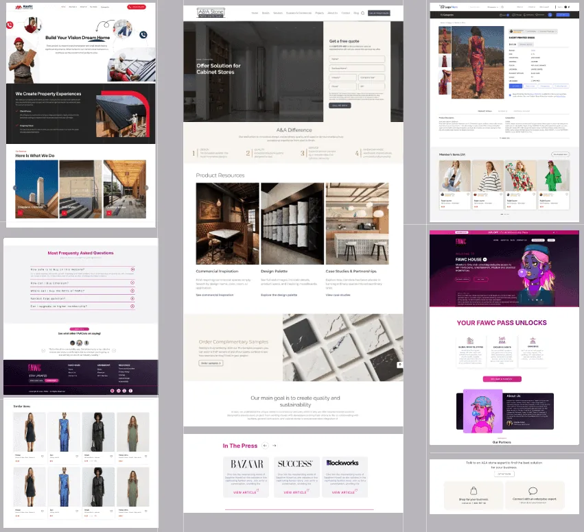
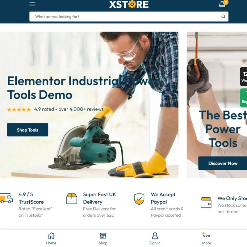
Responsive design, on every possible screen
We know that your audience is not only on desktop, which is why each design we make is responsive. Whether customers access your site on mobile, iPad, desktop or even TV.
We make responsive designs awesome with the help of


We know how important is to reach your audience on every platform. And with a beautiful design that works on all devices, you’ll never miss a customer.
Responsive design services include
Responsive design services are essential for businesses as they enable websites to adapt seamlessly to various devices, providing an optimal user experience and increasing engagement and conversions.
Make it the way you want it, on any device
Custom responsive design for a website is a specialized service that ensures your website looks and functions seamlessly across all devices, including desktops, laptops, tablets, and smartphones. A custom responsive design provides an optimal viewing experience, regardless of the screen size or orientation.
- Your website looks great & works seamlessly on any device
- Optimal viewing experience
- Increased engagement & conversions
- Boost your search engine rankings
- Better UX
- Faster loading speed
- Stand out from competition
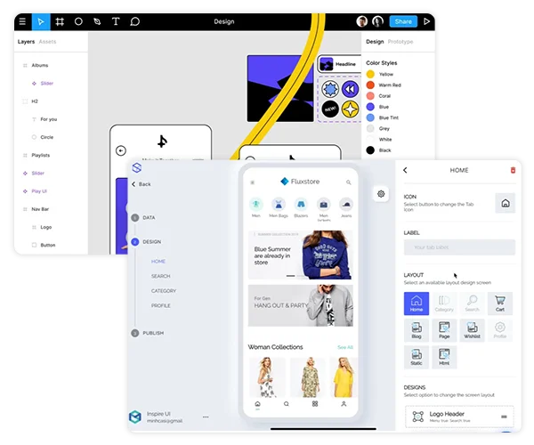
Change anything without struggle
An easy to modify responsive design provides businesses the ability to quickly and easily update their website’s appearance and functionality without compromising its responsiveness on different devices. With this service, website owners can ensure that their website remains up-to-date with the latest design trends and user preferences.
- Change design without coding
- Ensure that your site stays user friendly
- Beneficial in long-term
- Cost-effective changes
- Adjustable in any device
- No struggle changes

Get a Complete Audit & Action Plan
An easy-to-interact responsive design for a website is essential for providing a seamless user experience. With our service, we ensure that your website is not only visually appealing but also user-friendly, allowing your customers to easily navigate through your website on any device.
- Designs that adapt to all devices
- Seamless user experience
- Prioritize user engagement
- Easy to interact features
- Meet modern web design standards
- Easy to stand out
- Increased conversions & business growth

Get a Complete Audit & Action Plan
A better-to-convert design for your website is essential to improve user experience, increase engagement, and ultimately boost conversions. With our service, we analyze your target audience and create a design that speaks directly to them, resulting in more meaningful interactions and increased conversion rates.
- Design that is tailored to your audience behaviors
- Optimized perfectly for the devices your audience uses
- Clear call to action integrations
- Aesthetically pleasing designs
- Focus on hierarchy & easy navigation
- Continuous monitoring & improving

Our Clients
We build remarkable brands that generate real revenue!


Hiring Chambers Group for a resposive website design
At Chambers Group, we understand that having a responsive website design is essential for businesses to succeed in today’s digital world. Our team of experts is dedicated to providing custom and easy-to-modify responsive designs that are tailored to meet the unique needs of each client.

")
The Chambers Group at a glance
Digital Marketing Experts
Global Clients
Years of Experience
Monthly Social Reach
Products Launched
Average ROI

Schedule a free consultation
Connect with an expert and level up your marketing game.
Get your website on every screen
In today’s digital age, having a website that is accessible on any device is crucial for any business. That’s where responsive web design comes in. With responsive design, your website can adjust to any screen size, ensuring that your content is easily accessible and readable on desktops, tablets, and mobile devices.
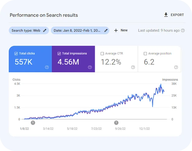
A responsive design will be great partner to your SEO progress
A responsive website design ensures that your website looks and functions well on any device, which can lead to a better user experience. This improved user experience can in turn improve your website’s search engine ranking, as search engines like Google prioritize websites that offer a positive user experience. Additionally, responsive design can help to reduce your website’s bounce rate and increase your website’s time on page, which are also important factors for search engine ranking.
Make your design future proof and easy to customize when needed
A future-proof website design that is easily customizable in the future is crucial for businesses that want to stay competitive in the ever-changing digital landscape. At Chambers Group, we believe that building a website that can adapt to new technologies and trends is just as important as creating a visually appealing site. With our focus on custom responsive design, we ensure that your website is not only optimized for different screen sizes but also future-proof and easily modifiable.

Find the answers you need (FAQs)
My Website isn’t getting enough traffic
Without consistent site traffic, you’re missing out on valuable visitors, leads, and revenue.
This is why you need our SEO solutions
My CPC from ad campaigns is too high
Tired of wasting dollars on ad campaigns? Our paid ad experts can help streamline your bidding strategy and refine ad targeting, so you get the maximun impact from your ads.
The Latest Blog Posts
Stay informed with the latest news and updates.

Ecommerce Marketing in Los Angeles: The Complete Guide to Growing Your Online Store with SEO, PPC, and Social Media in 2026

How to Get More Leads Online: 12 Proven Digital Marketing Strategies for Growing Your Business in 2026

The Complete Website Redesign Checklist for 2026: Everything You Need to Know
At The Chambers Group, our digital marketing agency excels in crafting cutting-edge web design solutions for businesses looking to enhance their online presence. As a leading Beverly Hills marketing agency located conveniently at 5839 Green Valley Cir, Culver City, CA 90230, we are committed to delivering responsive and engaging websites tailored to meet the unique needs of our clients. For more information on how we can assist your business, visit our website at chambersgroup.com or call us at 310-739-2877.


